PT
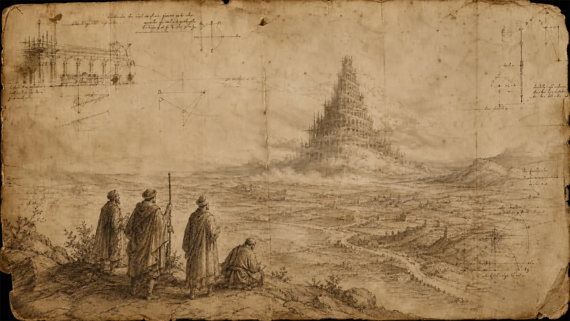
O ponto de partida deste projeto é o mito da Torre de Babel: a construção que cresce até que as línguas se confundem, obrigando seus construtores a interromper a obra e se dispersar.A leitura adotada aqui aproxima esse mito de uma segunda referência — a Biblioteca de Babel, de Jorge Luis Borges, que descreve uma estrutura infinita construída para conter todo o conhecimento possível. Essa aproximação não está no texto bíblico original; é uma camada literária, usada de forma deliberada para dar à marca um segundo nível de significado.A partir dessa leitura, o símbolo da Babel Tradutores — três balões de fala empilhados, formando uma torre — inverte o desfecho do mito. Em vez de uma estrutura que desaba pela falta de entendimento, ele representa uma torre que permanece de pé porque segue sendo traduzida, camada por camada. Essa é a ideia central que organiza todo o projeto: tradução e revisão como o que sustenta a construção do conhecimento entre línguas diferentes.
EN
This project starts from the myth of the Tower of Babel: a structure that keeps growing until languages become confused, forcing its builders to stop construction and disperse.The reading adopted here connects that myth to a second reference — Jorge Luis Borges' The Library of Babel, which describes an infinite structure built to contain all possible knowledge. This connection is not part of the original biblical text; it is a literary layer, used deliberately to give the brand a second level of meaning.Building on that reading, the Babel Tradutores symbol — three stacked speech bubbles forming a tower — reverses the myth's outcome. Instead of a structure that collapses from a lack of understanding, it represents a tower that remains standing because it keeps being translated, layer by layer. That is the central idea organizing the whole project: translation and proofreading as what holds the construction of knowledge together across different languages.
PT
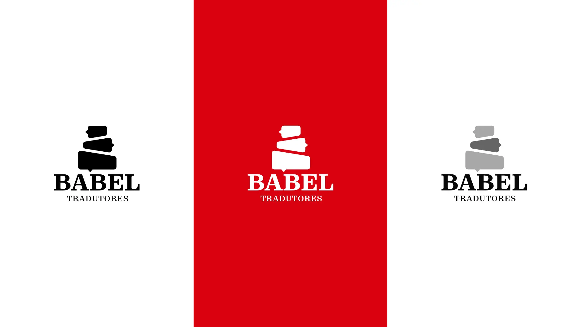
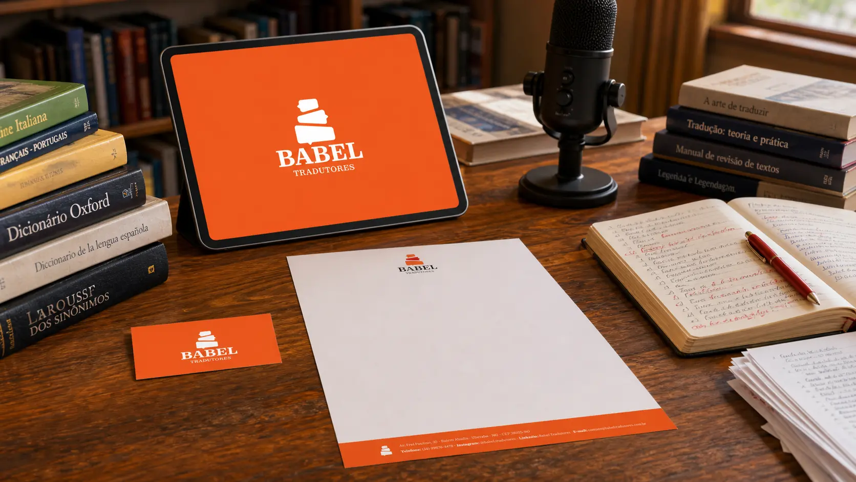
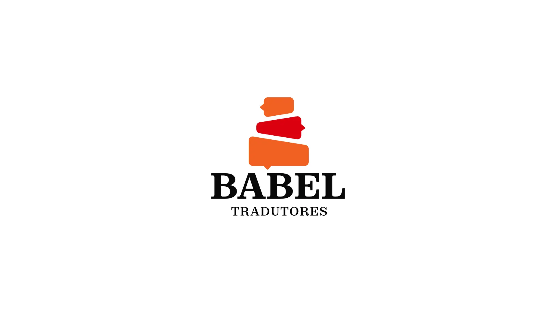
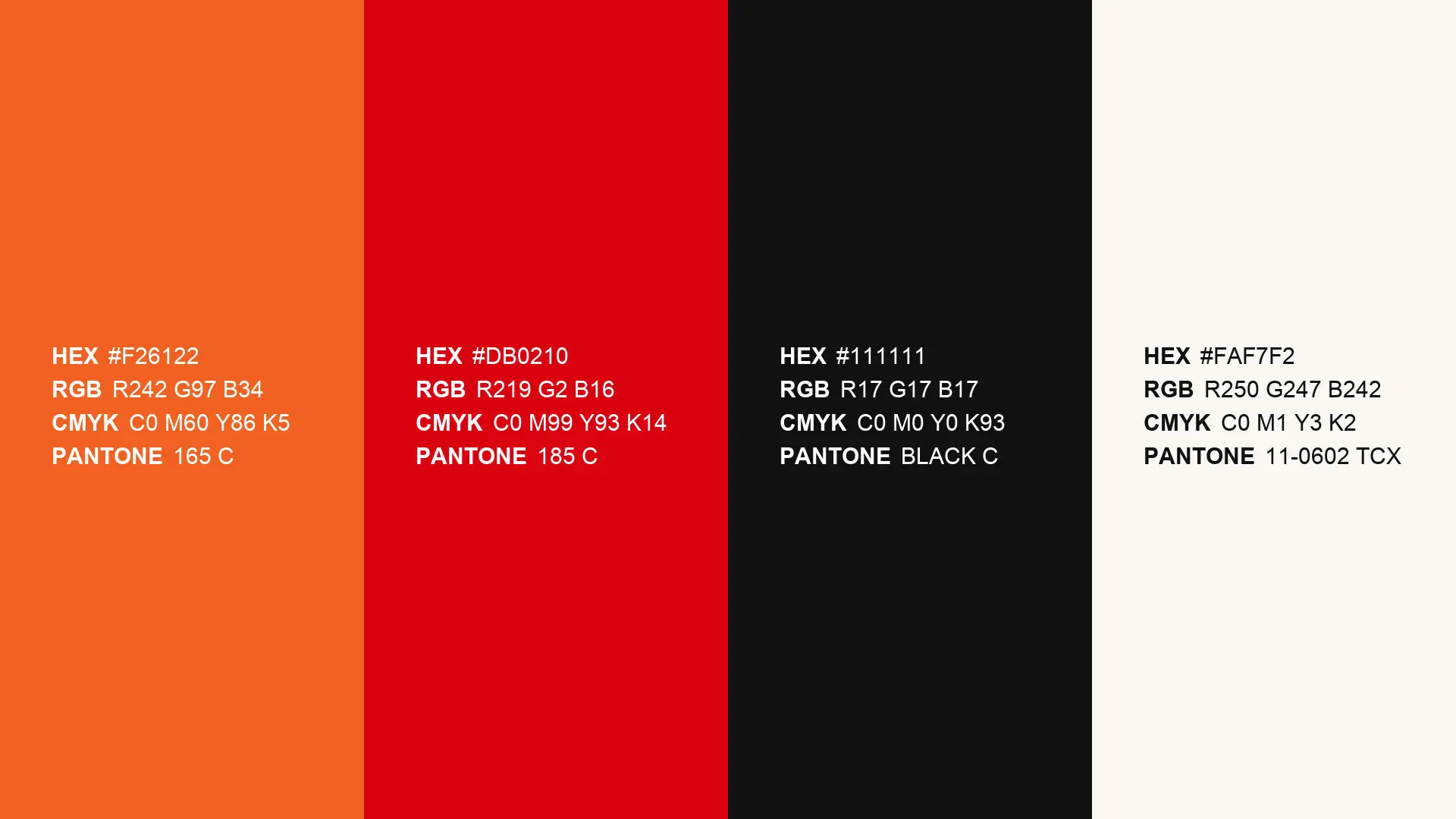
O símbolo é formado por três balões de fala empilhados, sem alinhamento perfeito entre eles — cada um está levemente girado e deslocado em relação ao que está abaixo, como pedras equilibradas umas sobre as outras.As três formas alternam duas cores: laranja no balão superior e no inferior, vermelho no balão do meio. Essa quebra de cor separa a peça central das outras duas, marcando um ponto de tensão no meio da composição.Os rabichos — a pontinha que indica a direção da fala em um balão de diálogo — apontam para lados diferentes em cada elemento: o de cima para a esquerda, o do meio para a direita, o de baixo para frente, na direção de quem olha. Não há um único ponto de escuta; cada camada fala para um lado.Lidas em conjunto, as três formas compõem a silhueta de uma pilha instável — mais larga na base, afunilando para cima — sustentada abaixo pelo nome da marca: BABEL em caixa alta, serifado e de traço grosso; TRADUTORES em versaletes espaçados, menor e mais discreto.
EN
The symbol is made of three stacked speech bubbles, without perfect alignment between them — each one is slightly rotated and offset from the one below it, like stones balanced on top of each other.The three shapes alternate between two colors: orange for the top and bottom bubbles, red for the middle one. This color break sets the central piece apart from the other two, marking a point of tension in the middle of the composition.The tails — the small pointed marks that indicate direction in a speech bubble — point to different sides on each element: the top one to the left, the middle one to the right, the bottom one forward, toward the viewer. There is no single point of listening; each layer speaks toward a different direction.Read together, the three shapes form the silhouette of an unstable stack — wider at the base, narrowing toward the top — held up below by the brand name: BABEL in bold serif capitals, TRADUTORES in smaller, letter-spaced small caps beneath it.
PT
O símbolo é formado por três balões de fala empilhados, sem alinhamento perfeito entre eles — cada um está levemente girado e deslocado em relação ao que está abaixo, como pedras equilibradas umas sobre as outras.As três formas alternam duas cores: laranja no balão superior e no inferior, vermelho no balão do meio. Essa quebra de cor separa a peça central das outras duas, marcando um ponto de tensão no meio da composição.Os rabichos — a pontinha que indica a direção da fala em um balão de diálogo — apontam para lados diferentes em cada elemento: o de cima para a esquerda, o do meio para a direita, o de baixo para frente, na direção de quem olha. Não há um único ponto de escuta; cada camada fala para um lado.Lidas em conjunto, as três formas compõem a silhueta de uma pilha instável — mais larga na base, afunilando para cima — sustentada abaixo pelo nome da marca: BABEL em caixa alta, serifado e de traço grosso; TRADUTORES em versaletes espaçados, menor e mais discreto.
EN
The symbol is made of three stacked speech bubbles, without perfect alignment between them — each one is slightly rotated and offset from the one below it, like stones balanced on top of each other.The three shapes alternate between two colors: orange for the top and bottom bubbles, red for the middle one. This color break sets the central piece apart from the other two, marking a point of tension in the middle of the composition.The tails — the small pointed marks that indicate direction in a speech bubble — point to different sides on each element: the top one to the left, the middle one to the right, the bottom one forward, toward the viewer. There is no single point of listening; each layer speaks toward a different direction.Read together, the three shapes form the silhouette of an unstable stack — wider at the base, narrowing toward the top — held up below by the brand name: BABEL in bold serif capitals, TRADUTORES in smaller, letter-spaced small caps beneath it.
PT
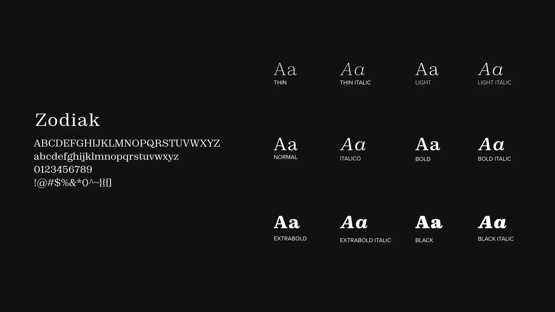
A fonte escolhida para a Babel Tradutores é a Zodiak, da Indian Type Foundry, distribuída pela Fontshare. É uma serifa com raiz declarada em duas referências: a tipografia de jornal contemporânea e as fontes do fim do século XIX, no modelo da Century. As serifas são grossas, em cunha, presas às hastes por um arremate (bracket) — um reforço estrutural da letra, não um traço decorativo.Essa escolha responde a duas exigências do projeto. A primeira é a leitura editorial que organiza toda a identidade: uma fonte nascida do jornal e do livro do século XIX carrega, na própria estrutura, a história da tipografia feita para levar conhecimento a um público amplo — o mesmo território de livros, teses e roteiros que a Babel Tradutores atravessa todos os dias. A segunda é a diversidade de público da empresa: a família tem 12 estilos — seis pesos, de Thin a Black, cada um com itálico correspondente, além de uma versão variável — o que garante o mesmo caráter tanto em textos corridos densos quanto em títulos de grande impacto, sem trocar de fonte entre um uso e outro.A opção por uma serifa, e não por uma geométrica sem serifas, foi deliberada: uma sans-serif comunicaria contemporaneidade, mas apagaria a referência ao livro e ao jornal que sustenta o conceito da marca. A Zodiak resolve as duas coisas — tem peso histórico suficiente para carregar a leitura editorial, e range de pesos e uma versão variável suficientes para funcionar em qualquer aplicação digital atual.
EN
The typeface chosen for Babel Tradutores is Zodiak, by Indian Type Foundry, distributed through Fontshare. It is a serif with a declared root in two references: contemporary newspaper typography and late-19th-century typefaces, based on the Century model. Its serifs are thick and wedge-shaped, attached to the stems by a bracket — a structural reinforcement of the letter, not a decorative stroke.This choice answers two requirements of the project. The first is the editorial reading that organizes the whole identity: a typeface born from the newspaper and the 19th-century book carries, in its own structure, the history of type made to bring knowledge to a wide audience — the same territory of books, theses, and scripts that Babel Tradutores works across every day. The second is the company's range of audiences: the family has 12 styles — six weights, from Thin to Black, each with a matching italic, plus a variable version — which keeps the same character across both dense running text and high-impact headlines, without switching typefaces between uses.Choosing a serif over a geometric sans-serif was deliberate: a sans-serif would communicate contemporaneity, but would erase the reference to the book and the newspaper that the brand concept depends on. Zodiak resolves both needs at once — it carries enough historical weight for the editorial reading, and enough weight range and variable support to work across any current digital application.